2022
Medito
Redesigning Medito - The Meditation App
Redesigning Medito - The Meditation App
Decluttering the UI and transforming the experience based on user feedback
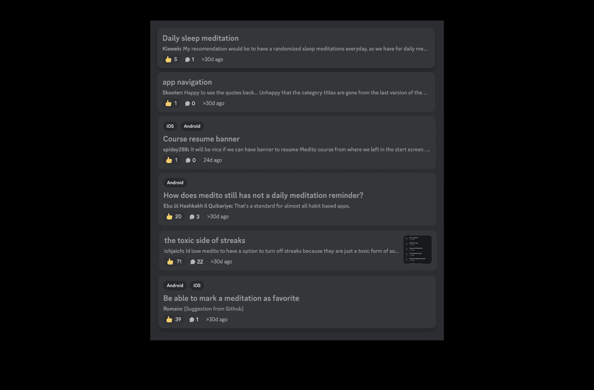
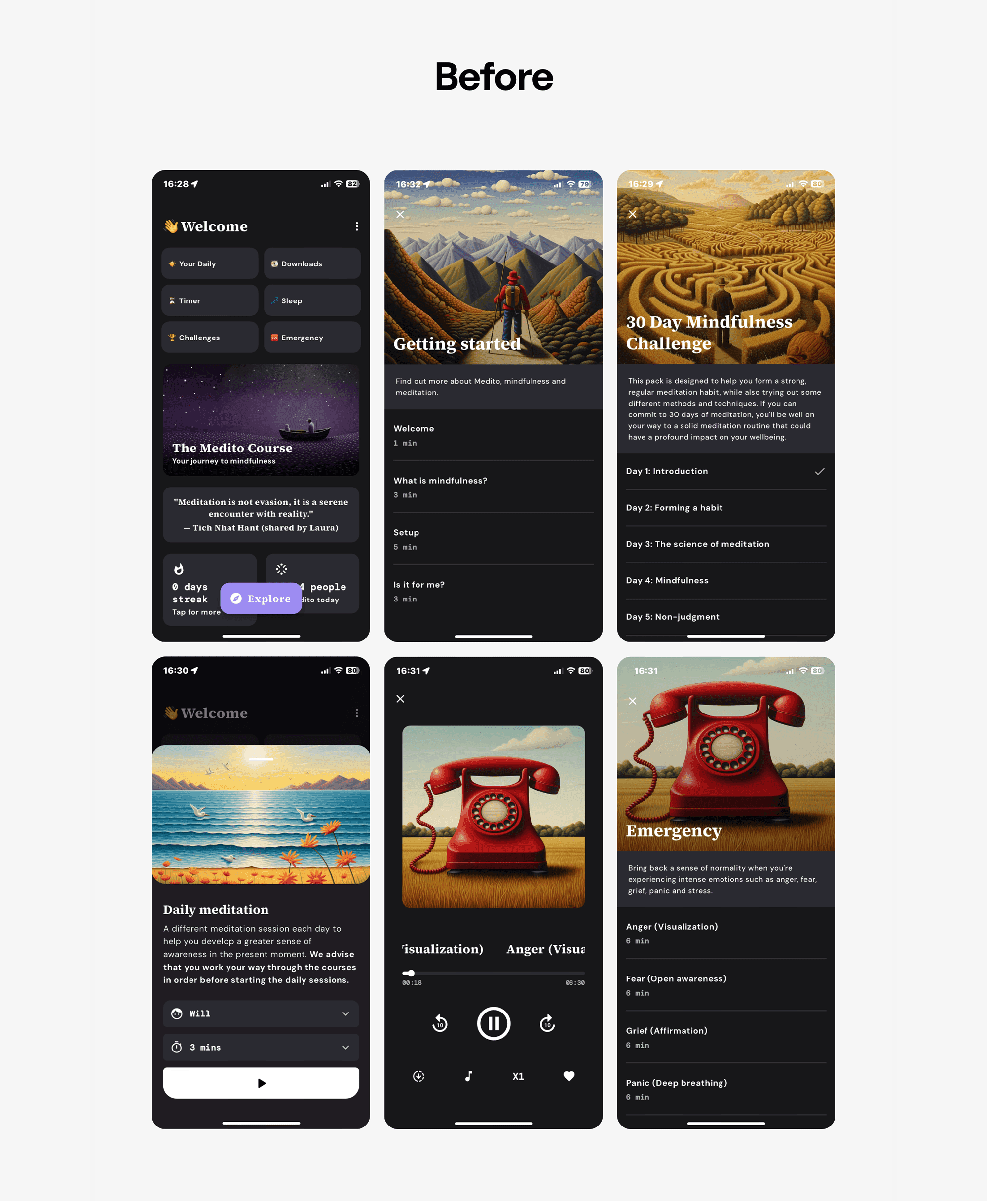
The Medito app boasts a vibrant community on Discord, with members sharing feedback almost daily. Drawing from the most frequent issues raised, I delved into redesigning the app to enhance the user experience.
The primary focus was on improving the navigation system and decluttering the UI to achieve a more minimalistic design that aligns with the app's tone and its users' preferences. Below, you'll find some of the problems shared by users that we aimed to address.
Decluttering the UI and transforming the experience based on user feedback
The Medito app boasts a vibrant community on Discord, with members sharing feedback almost daily. Drawing from the most frequent issues raised, I delved into redesigning the app to enhance the user experience.
The primary focus was on improving the navigation system and decluttering the UI to achieve a more minimalistic design that aligns with the app's tone and its users' preferences. Below, you'll find some of the problems shared by users that we aimed to address.
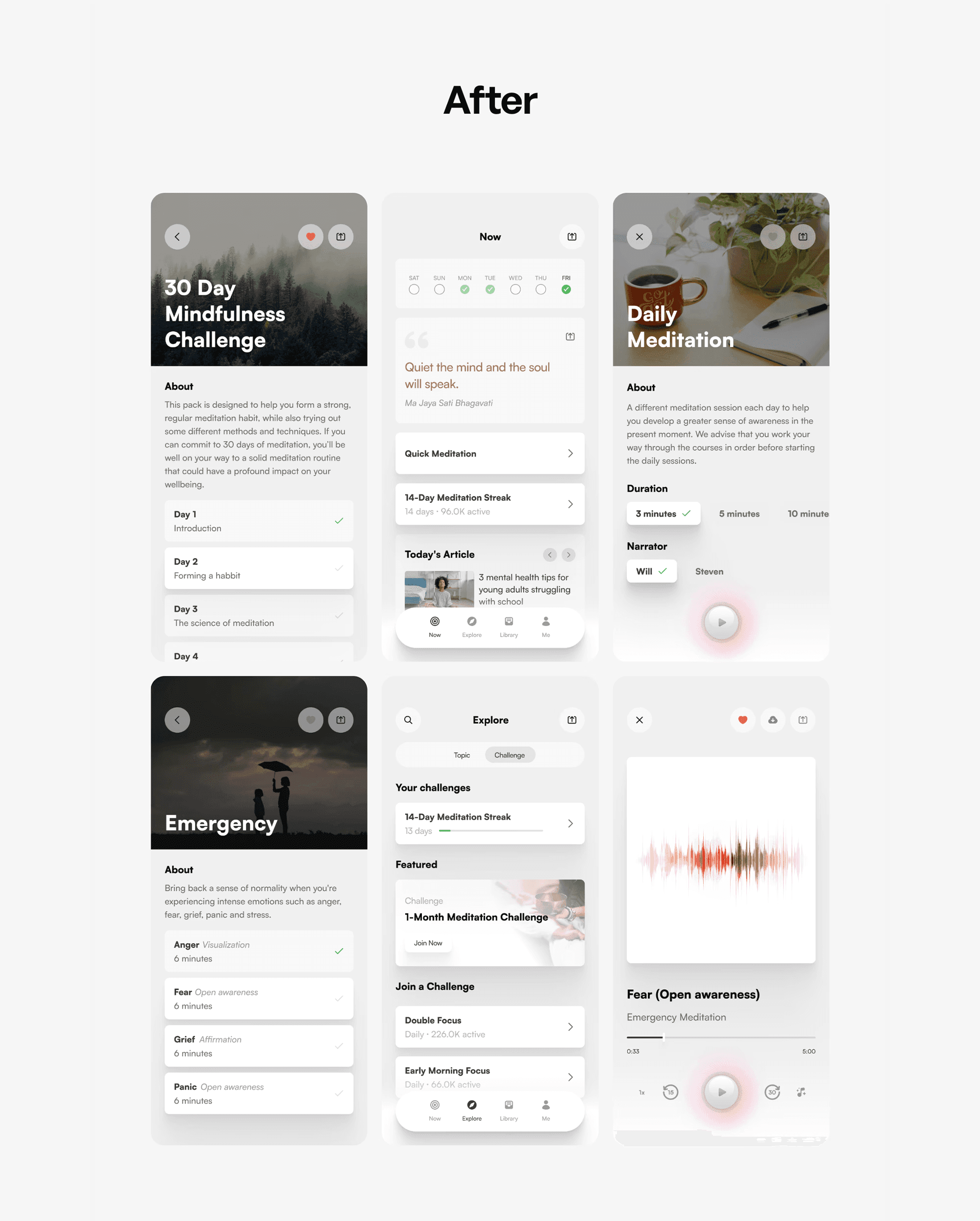
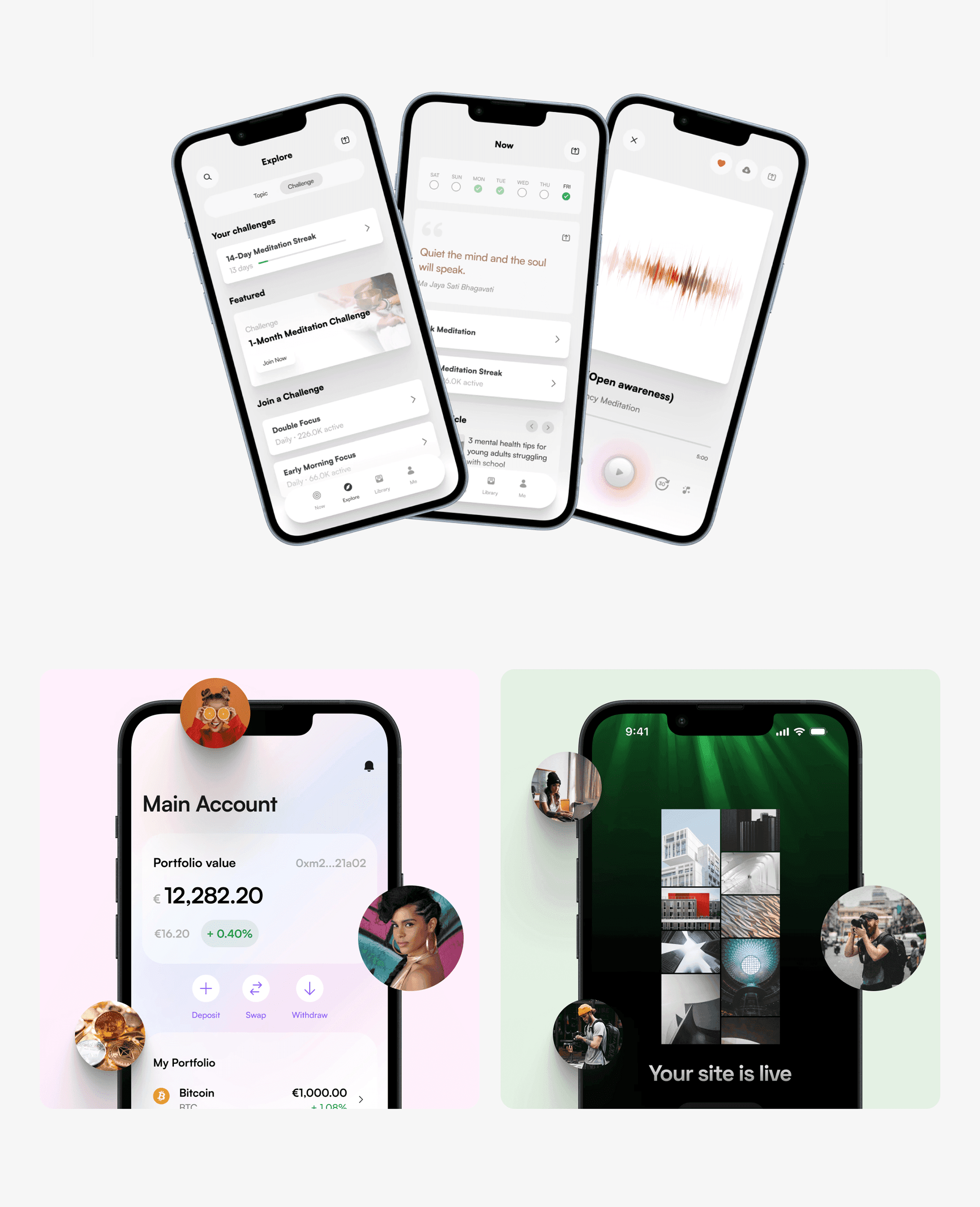
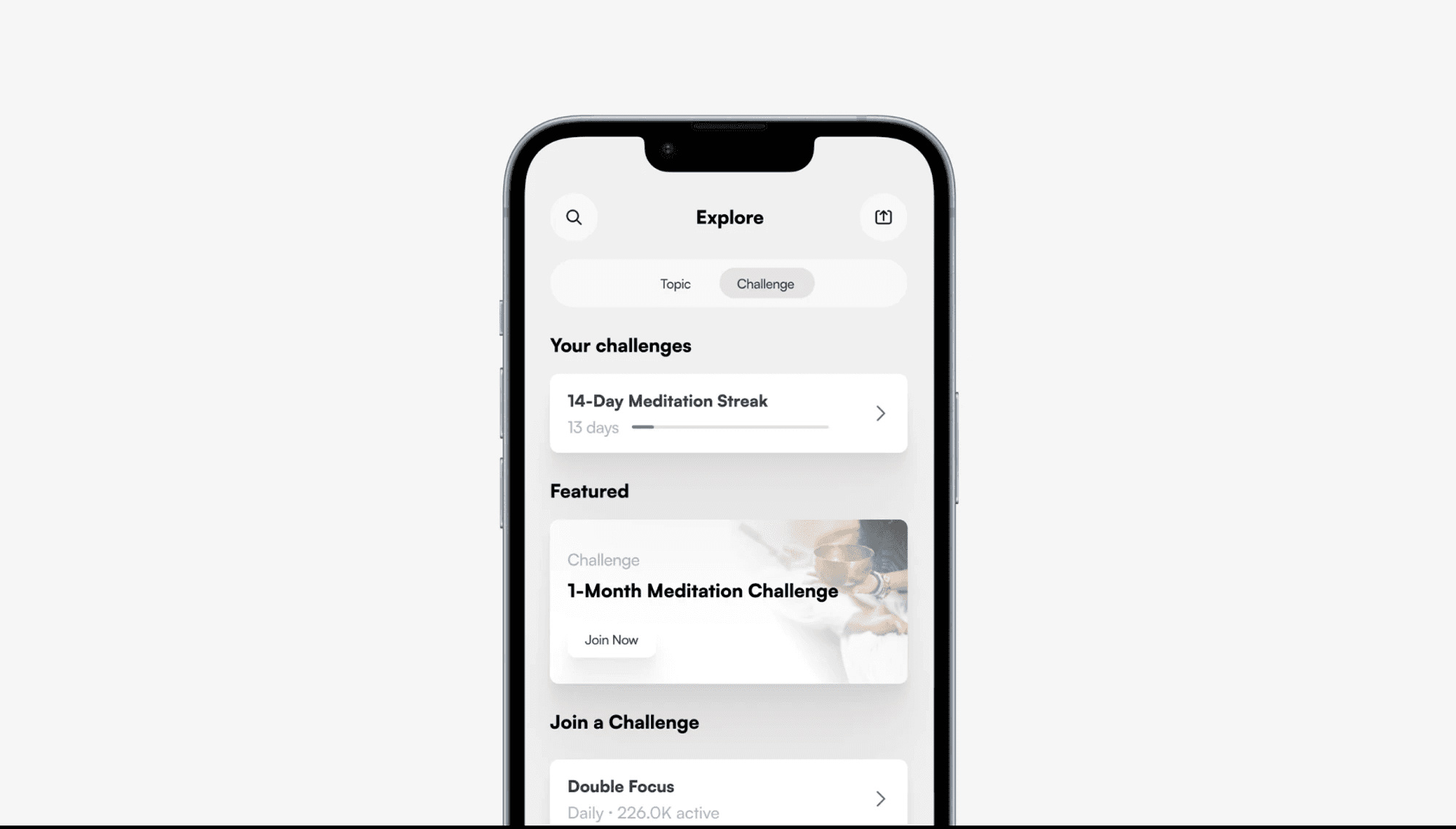
Results
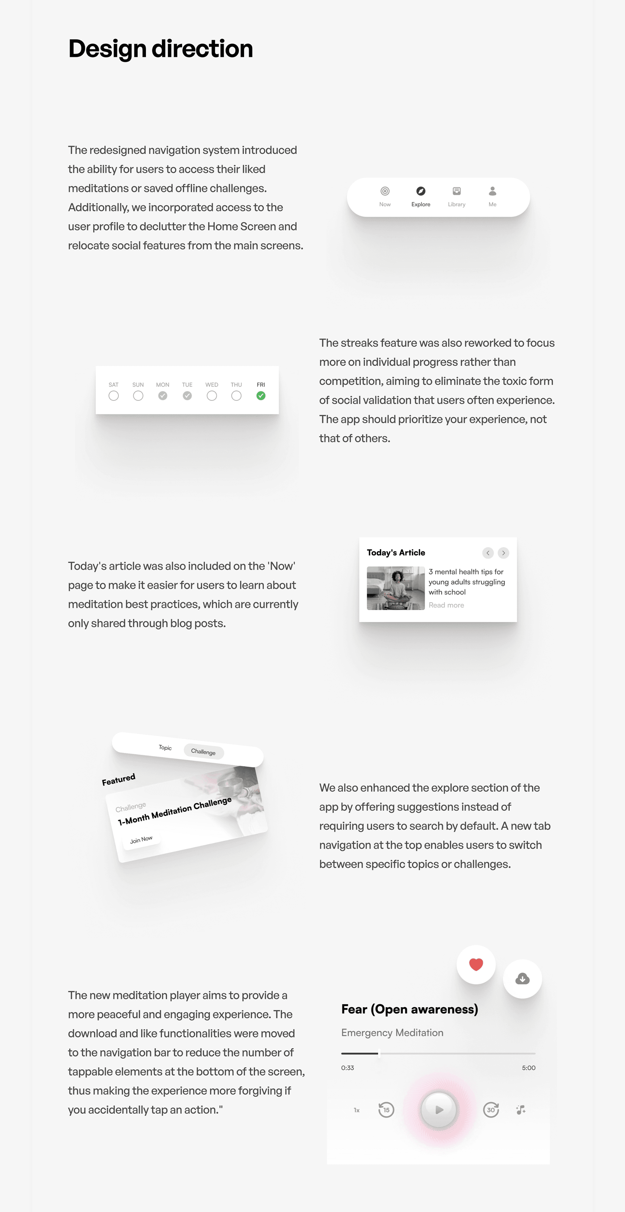
Our approach centered on gathering and incorporating user feedback to inform our design decisions. By prioritizing user input, we aimed to create a more tailored and user-centric experience.
Furthermore, our focus on cultivating a serene and tranquil atmosphere led us to adopt light tones and diffused shadows in the UI. This deliberate choice aimed to evoke a sense of depth and calmness, enhancing the overall user experience. Through these strategies, we strived to not only meet but exceed user expectations, fostering a harmonious interaction between design and user needs.
Results
Our approach centered on gathering and incorporating user feedback to inform our design decisions. By prioritizing user input, we aimed to create a more tailored and user-centric experience.
Furthermore, our focus on cultivating a serene and tranquil atmosphere led us to adopt light tones and diffused shadows in the UI. This deliberate choice aimed to evoke a sense of depth and calmness, enhancing the overall user experience. Through these strategies, we strived to not only meet but exceed user expectations, fostering a harmonious interaction between design and user needs.